How to Design Accessible Portfolio Layouts
Sarah Mitchell
April 17, 2025
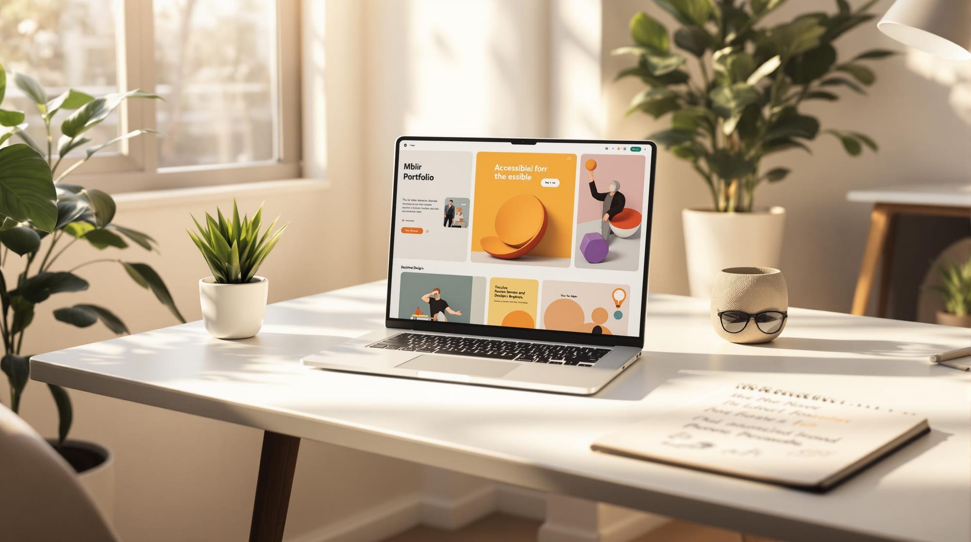
Want a portfolio everyone can use? Accessibility is key. It ensures your work reaches more people, including those with disabilities, while showcasing your technical skills and commitment to inclusivity.
Quick Tips for an Accessible Portfolio:
- Clear Navigation: Use proper HTML headings, keyboard-friendly menus, and "Skip to Main Content" links.
- Color Choices: Maintain a 4.5:1 contrast ratio and avoid relying only on color to convey meaning.
- Content Accessibility: Use readable fonts, alt text for images, captions for videos, and accessible interactive elements like forms.
- Responsive Design: Start mobile-first, use flexible grids, and ensure touch targets are at least 44x44px.
- Test Thoroughly: Use tools like WAVE, aXe, NVDA, and VoiceOver to check compatibility and usability.
Why it matters? Accessible portfolios stand out, reach more employers, and reflect a professional edge in the job market.
UX Design Expert Teaches How To Design Accessible ...
Key Elements of Accessible Portfolios
Designing an accessible portfolio ensures that everyone, regardless of ability, can engage with your work.
Clear Layout and Navigation
A clean, structured layout is the backbone of accessibility. Navigation should be simple and consistent across all pages. Here's how to make it work:
- Use semantic HTML headings (h1–h6) in proper hierarchical order
- Enable keyboard navigation so users can tab through content
- Keep menus consistent in placement and structure
- Add "Skip to Main Content" links for screen reader users
- Ensure interactive elements have visible focus indicators
The layout should follow a logical reading flow, with a clear visual hierarchy that guides users naturally through your content.
Thoughtful Use of Color
Color choices play a crucial role in accessibility, especially for users with visual impairments or color blindness. Keep these points in mind:
- Ensure a contrast ratio of at least 4.5:1 for regular text and 3:1 for large text
- Avoid relying solely on color to communicate information
- Use patterns or textures alongside colors in charts and graphs
- Provide alternative text for color-coded elements
- Test your color palette with colorblind simulation tools
Once your colors are accessible, focus on ensuring all text and media are easy to use and understand.
Accessible Content
Accessible content allows every visitor to engage with and understand your work. Here’s how to make your portfolio content user-friendly:
- Text Content
Choose clear, legible fonts and maintain proper spacing. Keep paragraphs short and break up long sections with subheadings and white space.
- Media Elements
Make non-text content accessible by including the following features:
| Media Type | Accessibility Features |
|---|---|
| Images | Alt text, descriptive captions |
| Videos | Closed captions, transcripts |
| Audio | Text transcripts |
| Animations | Pause/stop controls, reduced motion options |
- Interactive Features
Interactive elements like forms, filters, or galleries should work seamlessly with:
- Keyboard navigation
- Screen readers
- Voice commands
- Touch interfaces
Building Your Accessible Portfolio
Planning Your Layout
Before diving into development, map out your portfolio's structure. Start by creating a content hierarchy that highlights key information and ensures everything flows logically. Focus on these key points:
- Define your primary navigation paths.
- Organize content sections and their relationships.
- Identify critical interaction points.
- Plan navigation and content structure before addressing responsiveness.
For spacing, aim for 16–24px between smaller content blocks and 32–48px for larger sections. Once your layout is planned, you can move forward with building your portfolio using a responsive framework.
Building the Portfolio
When building your portfolio, precision matters. Follow these steps to create a functional and accessible design:
Responsive Framework
- Begin with a mobile-first approach.
- Use fluid typography, starting with a 16px base font.
- Utilize a flexible 12-column grid system.
- Set a maximum content width of 1200-1400px for optimal readability.
Navigation Structure
- Limit main menu items to 5-7 options.
- Ensure touch targets are at least 44x44 pixels.
- Add breadcrumbs for deeper navigation layers.
Content Implementation
- Use proper heading levels (H1–H6) for clear structure.
- Incorporate ARIA landmarks for dynamic content.
- Enable lazy loading for images to improve performance.
- Provide descriptive alt text for all images.
Once your layout and content are in place, move on to testing and refining for accessibility.
Testing and Improving
Testing is a critical step to ensure your portfolio meets accessibility standards. Use a combination of assistive technologies and automated tools to evaluate your work:
| Testing Phase | Tools/Methods | Key Checks |
|---|---|---|
| Development | WAVE, aXe | HTML validation, ARIA implementation |
| Pre-launch | NVDA, VoiceOver | Screen reader compatibility, keyboard navigation |
| Post-launch | User feedback, Analytics | Usage patterns, interaction points |
Key areas to focus on include:
- Smooth keyboard navigation.
- Accurate screen reader announcements.
- Sufficient color contrast ratios.
- Properly sized touch targets.
- Clear labels and instructions for form fields.
Test your portfolio across various devices and browsers to ensure a consistent experience for all users. Regular testing helps catch and resolve issues before they affect accessibility.
For an easier development process, try using scale.jobs' Portfolio Website Generator. This tool includes built-in accessibility features, allowing you to focus on customizing your portfolio while staying compliant with WCAG guidelines.
Accessibility Tools and Resources
Making your portfolio accessible goes beyond initial testing. Using targeted tools and resources can help fine-tune its accessibility features.
Testing Software
Here are some tools to check your portfolio's accessibility:
-
Browser Extensions:
- WAVE: A free extension for Chrome and Firefox that identifies accessibility issues and highlights WCAG errors.
- Axe DevTools: Automates accessibility tests, offering detailed reports and suggestions for fixes.
- Color Contrast Analyzer: Ensures your text meets WCAG 2.1 contrast standards.
-
Screen Reader Testing:
- NVDA: A free screen reader for Windows that helps test navigation and content readability.
- VoiceOver: Built into macOS and iOS devices, this tool is great for testing on Apple platforms.
- JAWS: A professional screen reader offering advanced testing options for detailed evaluations.
| Testing Category | Key Checks | Recommended Tools |
|---|---|---|
| Visual Design | Color contrast, text sizing | Color Contrast Analyzer |
| Navigation | Keyboard access, focus states | NVDA, VoiceOver |
| Content Structure | Heading hierarchy, ARIA roles | Axe DevTools |
| Media Elements | Alt text, captions | Manual review |
These tools provide deeper insights into specific accessibility aspects, complementing your earlier testing efforts.
scale.jobs Portfolio Website Generator
For job seekers, scale.jobs' Portfolio Website Generator is a helpful tool. It enables users to create professional, accessible portfolios while integrating smoothly with standard accessibility testing tools. The platform simplifies the process of building and optimizing accessible designs.
"Applying jobs everyday has been super daunting. But now with scale jobs, one can apply 100s of jobs per day as well as focus on prep for interviews." - Sona Tambe
According to scale.jobs, 93% of their users secured full-time roles within three months.
Do's and Don'ts
Here’s a quick guide to help you create accessible portfolios. These tips align with the strategies we've already covered:
| Do's | Don'ts |
|---|---|
Use semantic HTML elements like <header>, <nav>, <main>, and <footer> |
Avoid using generic <div> tags for structure |
| Keep navigation patterns simple and consistent | Don't create complex or unpredictable navigation flows |
| Add alt text to all images, including project thumbnails | Skip alt text or leave decorative images without null attributes |
| Use ARIA labels for interactive elements | Avoid custom controls without proper ARIA support |
| Ensure a 4.5:1 color contrast ratio for text | Use low-contrast color combinations |
| Include focus indicators for interactive elements | Remove default focus outlines without offering alternatives |
This table sums up the basics. Below, we’ll dig deeper into best practices and common pitfalls to avoid.
Essential Design Practices
When crafting your portfolio layout, keep these in mind:
- Navigation matters. Use logical, keyboard-friendly navigation that works seamlessly with screen readers. Menus should be accessible via the Tab key, with clear focus indicators.
- Touch targets are key. For mobile users, make sure interactive elements are at least 44x44 pixels to support those with motor impairments.
Common Mistakes to Avoid
Here are a few things to steer clear of:
- Don’t rely only on color to convey meaning. Add icons, patterns, or text labels for clarity.
- Avoid fixed pixel sizes for text. Instead, use relative units like
remoremfor better scalability. - Skip auto-playing videos or animations that might distract users or disrupt screen readers.
Technical Considerations
- Always include visible labels for form inputs. Placeholders alone aren’t enough.
- Set the correct language attribute in your HTML (e.g.,
<html lang="en">). - Provide downloadable files in accessible formats like PDF and HTML.
Before you launch your portfolio, test it thoroughly. Check keyboard navigation, heading structure, color contrast, form labels, and focus states to ensure everything works smoothly.
Summary
A well-organized, accessible portfolio not only broadens your audience but also highlights your dedication to inclusive design, ensuring potential employers and clients can easily interact with your content. Here are some key principles to guide your portfolio design:
Top Tips for Creating an Accessible Portfolio:
- Use semantic HTML as the foundation for accessibility.
- Maintain a minimum color contrast ratio of 4.5:1 for clear readability.
- Design 44x44 pixel touch targets to support users with motor challenges.
- Ensure keyboard navigation and compatibility with screen readers.
- Include alt text and ARIA labels for better usability.
"We're not just another job application service. We're a team that understands your struggles firsthand. We're here to take the burden off your shoulders, so you can focus on what truly matters – preparing for interviews and building meaningful connections." - Leela Yanamaddi, Co-Founder
Accessibility benefits everyone by creating more inclusive experiences. Incorporating these principles into your portfolio design can help you reach a wider audience and demonstrate your commitment to inclusion.
If you're short on time, consider using our website generator, which seamlessly integrates accessibility best practices into your portfolio.
Before finalizing your portfolio, make sure to review these essential checks:
| Aspect | Key Check |
|---|---|
| Visual | WCAG contrast ratios |
| Navigation | Functional keyboard controls |
| Content | Descriptive alt text |
| Structure | Logical heading hierarchy |
| Interactive | Proper button/form labels |
Regular testing and updates will help your portfolio stay aligned with accessibility standards as technology evolves. By following these guidelines, you strengthen your professional image and show your dedication to creating inclusive experiences.